Chart Patterns as Observation Language
Learn how to read chart patterns as market structure and behavior, without treating triangles, flags, wedges, or reversal patterns as trading signals.
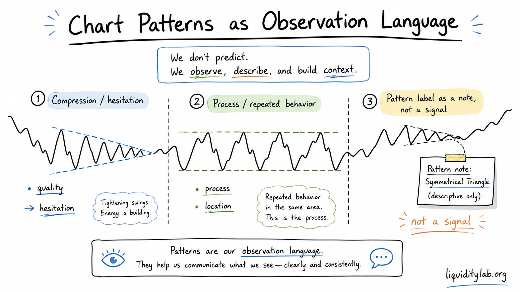
Chart patterns are often taught as if they were visual shortcuts.
Triangle means breakout. Flag means continuation. Head and shoulders means reversal.
That style of learning is easy to remember, but it is also easy to misuse.
In LiquidityLab, chart patterns are treated as an observation language. They help describe how price has behaved over a period of time. They do not provide buy direction, sell direction, entries, exits, stop placement, profit targets, position sizing, leverage, or return expectations.
The core boundary
A chart pattern is not a command.
It is a summary of a process.
Instead of asking:
What does this pattern tell me to do?
ask:
What behavior did price repeat long enough for this pattern to become visible?
That small change matters. It moves the pattern from the execution layer into the reading layer.
A pattern is a process, not a picture
A single candle shows one moment.
A chart pattern shows a sequence.
For example:
- repeated tests of the same area
- decreasing volatility
- failed attempts to continue
- slower reactions after each push
- cleaner or messier structure over time
The value is not in the label by itself. The value is in the behavior that created the label.
If the label is clear only after the move has already happened, the pattern may be more useful for review than for real-time observation.
Why beginners overuse chart patterns
Patterns feel comforting because they create a name for uncertainty.
When price is compressing, rotating, or hesitating, the chart can feel messy. A pattern label seems to make the mess easier to handle.
But a label can also hide uncertainty.
The common beginner mistake is:
- draw a familiar shape
- assume the shape implies a direction
- ignore market state, location, and invalidation
- become frustrated when the pattern fails
The safer habit is:
- identify the current market state
- describe the visible structure
- note where the pattern is forming
- ask what would make the reading clearer or invalid
Pattern location matters
The same pattern can mean different things in different locations.
A tight compression after a clean trend may describe a pause.
The same compression in the middle of a noisy range may describe nothing more than temporary indecision.
A potential reversal pattern near a major structural boundary deserves more attention than the same shape floating in the middle of a random area.
Before naming the pattern, ask:
- Is price trending, pulling back, ranging, or transitioning?
- Is the pattern forming near a meaningful high, low, range boundary, or liquidity area?
- Is the pattern interrupting an existing move, or is it appearing inside a structure that was already unclear?
- Does the pattern make the chart easier to describe, or does it force a story onto the chart?
Continuation and reversal are context labels
Many textbooks divide chart patterns into continuation patterns and reversal patterns.
That division can be useful, but only after the context is clear.
Continuation means the pattern appears inside an existing directional structure and may describe a pause, digestion, or compression.
Reversal means the pattern appears after an established move and may describe weakening, failed continuation, or a transition process.
Neither word proves what price will do next.
They are context labels, not predictions.
Triangles
Triangles are easy to draw and easy to over-trust.
In safe observation language, a triangle often says:
price is compressing and the market has not fully resolved the disagreement yet.
It does not say:
breakout is guaranteed.
Useful observations include:
- whether both sides of the triangle have enough touch points to be meaningful
- whether volatility is genuinely compressing
- whether the triangle appears after a clear move or inside a larger range
- whether price is simply becoming narrower without producing useful structure
The most important question is not "which direction will it break?"
The better question is:
What would show that the compression has actually resolved?
Flags and wedges
Flags and wedges are often taught as continuation structures.
They can describe a pause after a directional move, but the label should not replace the broader structure reading.
For observation, separate three things:
- the prior move
- the corrective or compressive segment
- the behavior after price leaves the segment
If the prior move was weak or unclear, the flag or wedge label is less useful.
If the corrective segment is noisy, overlapping, and hard to define, the pattern may be more like a range than a clean continuation structure.
Compression families: triangles, flags, and wedges
Triangles, flags, and wedges often belong to the same broad family: compression after movement.
The names are different, but the observation task is similar:
- What was the move before the compression?
- Is the current segment tightening, drifting, or simply rotating?
- Are the highs and lows becoming cleaner or messier?
- Is price compressing near a meaningful boundary or in the middle of noise?
- What would show that compression has resolved?
This keeps the pattern useful without turning it into a forecast.
A flag may look like a pause. A wedge may look like pressure building. A triangle may look like disagreement narrowing. But none of those labels proves direction.
For LiquidityLab, the safer language is:
This pattern describes how price is compressing. It does not decide what price must do after compression.
Classical pattern families as reference groups
Some teaching systems group familiar chart patterns into broad families such as continuation, reversal, and trap-like compression.
LiquidityLab keeps that taxonomy only as review language.
It can help you remember why a triangle felt coiled, why a flag felt like a pause, or why a wedge felt more and more fragile. But the family label still depends on location, structure quality, and later confirmation.
The family is a reference, not a conclusion.
Reversal patterns
Head and shoulders, double tops, double bottoms, rounding structures, and V-shaped turns are often described as reversal patterns.
The risk is that learners treat the pattern name as proof that the prior trend is finished.
LiquidityLab reads reversal patterns as transition evidence, not final verdicts.
A safer reading asks:
- Has the prior structure actually weakened?
- Did price fail to continue in the old direction?
- Is there a meaningful structural boundary nearby?
- Has the new side produced enough structure to matter?
- What would make the reversal reading invalid?
Until those questions are clearer, a reversal pattern is only a possible transition.
Symmetry can concentrate attention
Double tops and double bottoms are especially easy to over-trust because they look orderly.
Two similar highs or lows can make the chart feel more certain than it really is. In practice, that symmetry often tells you where attention may be clustered, not where price must reverse.
For review, write:
- which highs or lows created the symmetry
- whether the area is near meaningful structure
- whether price accepted beyond the area, rejected it, or returned inside the prior range
- what would make the pattern reading less useful
This keeps symmetrical patterns in the observation layer. It does not turn them into reversal signals.
Slow turns and fast turns
Rounding structures and V-shaped turns describe very different reversal tempos.
A rounding structure usually describes slow transition:
- the prior move loses energy gradually
- price spends time in a quieter area
- volatility and attention may shrink before returning
- the pattern often becomes clearer only after a long sample
A V-shaped turn describes fast emotional change:
- the prior move is sharp
- the turn happens with little preparation
- there may be no clean consolidation area
- the pattern is often easier to recognize in hindsight than in real time
Both labels are useful for review.
Neither label means the reversal is available to trade.
For LiquidityLab, the safer question is:
Did this pattern describe a slow transition, a fast emotional turn, or a label I forced onto the chart after the fact?
Pattern quality
Not every pattern deserves the same attention.
A higher-quality pattern is usually easier to describe without forcing the chart:
- the relevant highs and lows are visible
- the location makes sense
- the internal structure is not excessively noisy
- the pattern does not require constant redrawing
- the label still makes sense when zooming out
A lower-quality pattern often requires imagination:
- unclear start and end points
- many overlapping candles
- too many adjusted trendlines
- no meaningful location
- a label that changes depending on which candles are included
If a pattern needs too much explanation to exist, it may not be helping.
A safe observation routine
Use this sequence before naming the pattern:
- Market state: trend, pullback, range, or transition?
- Location: where is price relative to meaningful structure?
- Behavior: is price expanding, contracting, rotating, or failing?
- Pattern label: what name describes the behavior, if any?
- Invalidation: what would make this pattern reading less useful?
The pattern label comes fourth, not first.
Common misuse
Avoid these shortcuts:
- treating a triangle as a breakout signal
- treating a flag as a guaranteed continuation
- treating a head and shoulders pattern as automatic reversal proof
- drawing patterns before identifying market state
- changing the pattern label whenever price fails to match the first story
- using a pattern to justify entries, stops, targets, leverage, or position size
Patterns should slow down the reading process, not rush it.
How this fits LiquidityLab
In the Market Structure OS, chart patterns sit underneath neutral structure reading.
Use them after you can already describe:
- current market state
- key structural boundaries
- visible liquidity areas
- price-action rhythm
- uncertainty and invalidation
Then a pattern can become a useful shorthand.
Without that foundation, the pattern becomes a decoration.
Review questions
When reviewing a chart pattern, ask:
- Did the label help me describe the structure, or did it make me overconfident?
- Did I identify the pattern before or after the important move?
- Did I define what would invalidate the pattern reading?
- Did the pattern appear in a meaningful location?
- Did I confuse a pattern label with a trading plan?
The goal is not to stop using chart patterns.
The goal is to use them in the right layer.
Chart patterns are useful when they help you describe market behavior more clearly.
They become dangerous when they pretend to tell you what to do.
Educational content only. Not financial advice.